ANS Australia
Logo and website for a corridor enterprise. Australia into Papua New Guinea.
Brief
The brief.
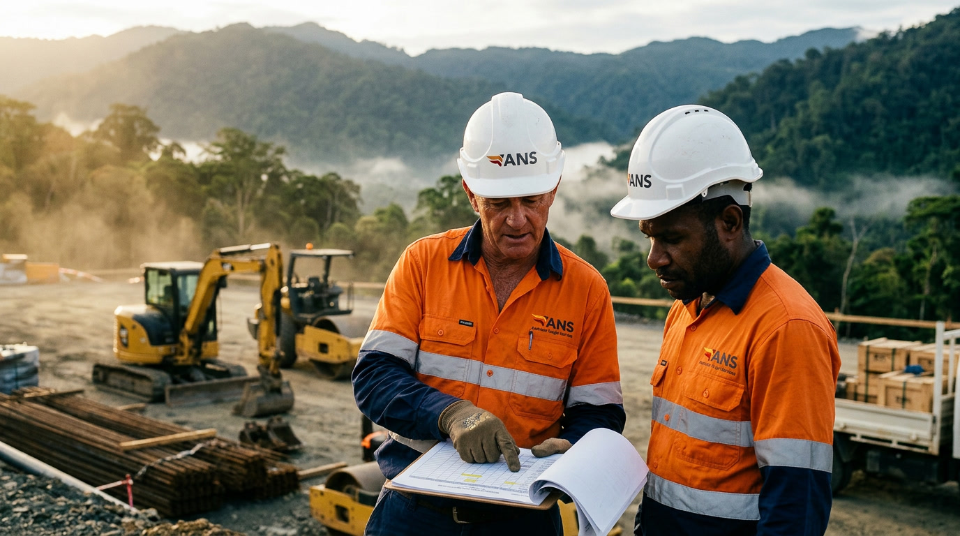
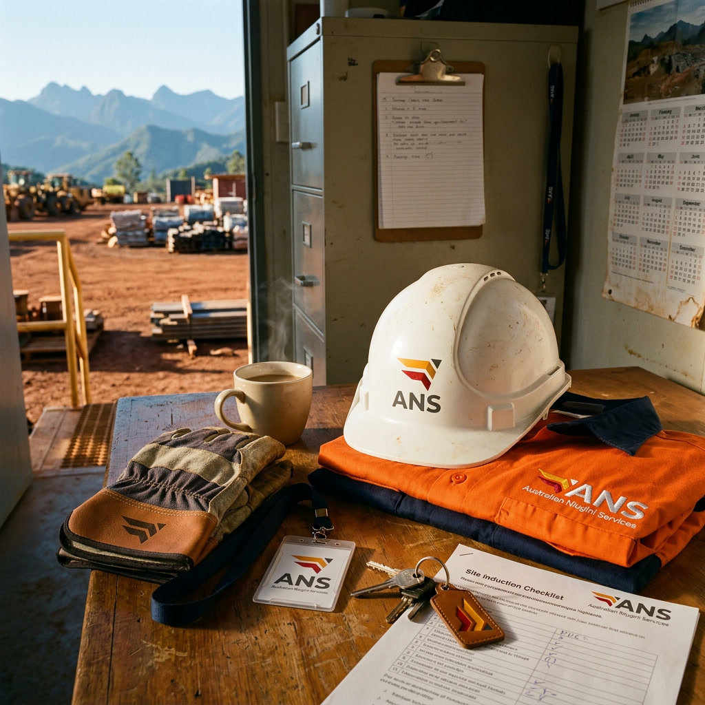
Australian Niugini Services was founded in 2022 to be a single, reliable partner for Australian businesses operating in Papua New Guinea across procurement, hospitality, construction supply, and telecoms. The name does corridor work before the brand says anything. "Niugini" is Tok Pisin for Papua New Guinea, embedded in the company name as a statement of specialisation. Graaft made the logo and the website. Both had to read the corridor first.
Approach
How we
tackled it.
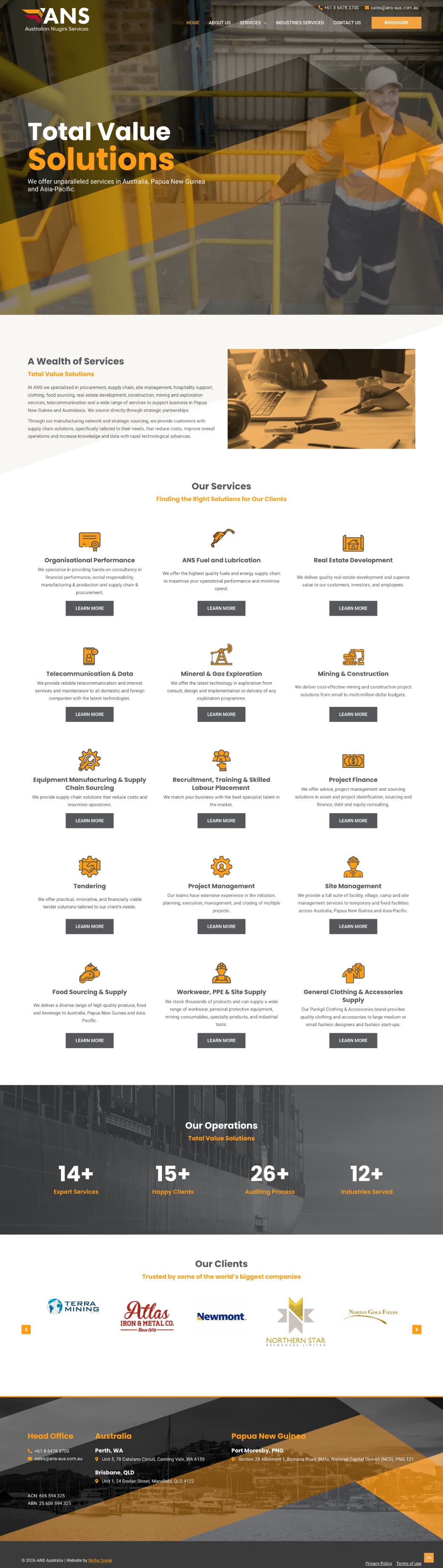
The mark reads the corridor. Stacked chevrons in ANS Red and ANS Orange, led by a Slate triangle. Forward-moving geometry. Red and orange read PNG; Slate reads Australia. The palette names the corridor on its own. The wordmark pairs "ANS" bold for procurement teams who already know the company with the full Australian Niugini Services line below for buyers meeting it for the first time. The website organises eight service lines into a coherent capability story. Procurement. Hospitality. Construction supply. Telecoms. Plus four more across the corridor. Structured for B2B buyers assessing partner range before the first call.

Colour
ANS Red
#C20A30Slate
#4B5056ANS Orange
#FF9F15White
#FFFFFFType
 Futura Std Bold
 Gilroy Medium
Procurement, construction supply, and telecoms. Australian businesses in Papua New Guinea.


Website
The
corridor,
built in.
Eight service lines organised into a coherent capability story. Built for procurement teams reading partner range and corridor knowledge before the first call.
Outcome
The
result.
The brand entered a specialised market reading like it knew the corridor. Procurement teams, mining groups, and construction companies could place ANS before the first conversation. The naming did its work. The mark did its work. The site organised eight service lines a buyer could read top to bottom.