Social Link Recruitment
Every dot is a person. Placement by placement, they make a difference together.

Brief
The brief.
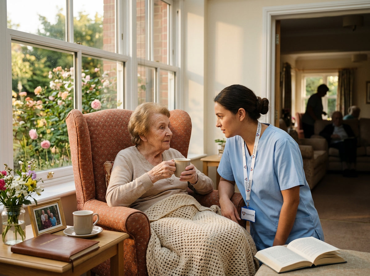
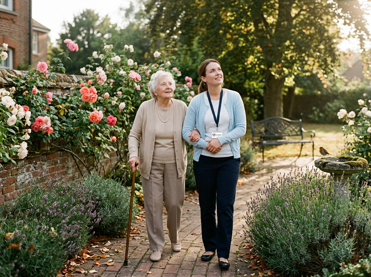
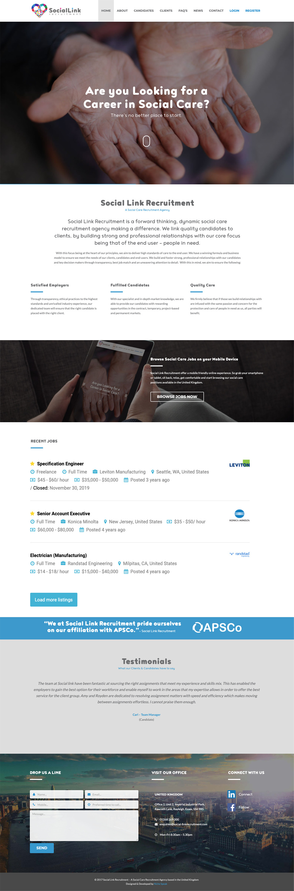
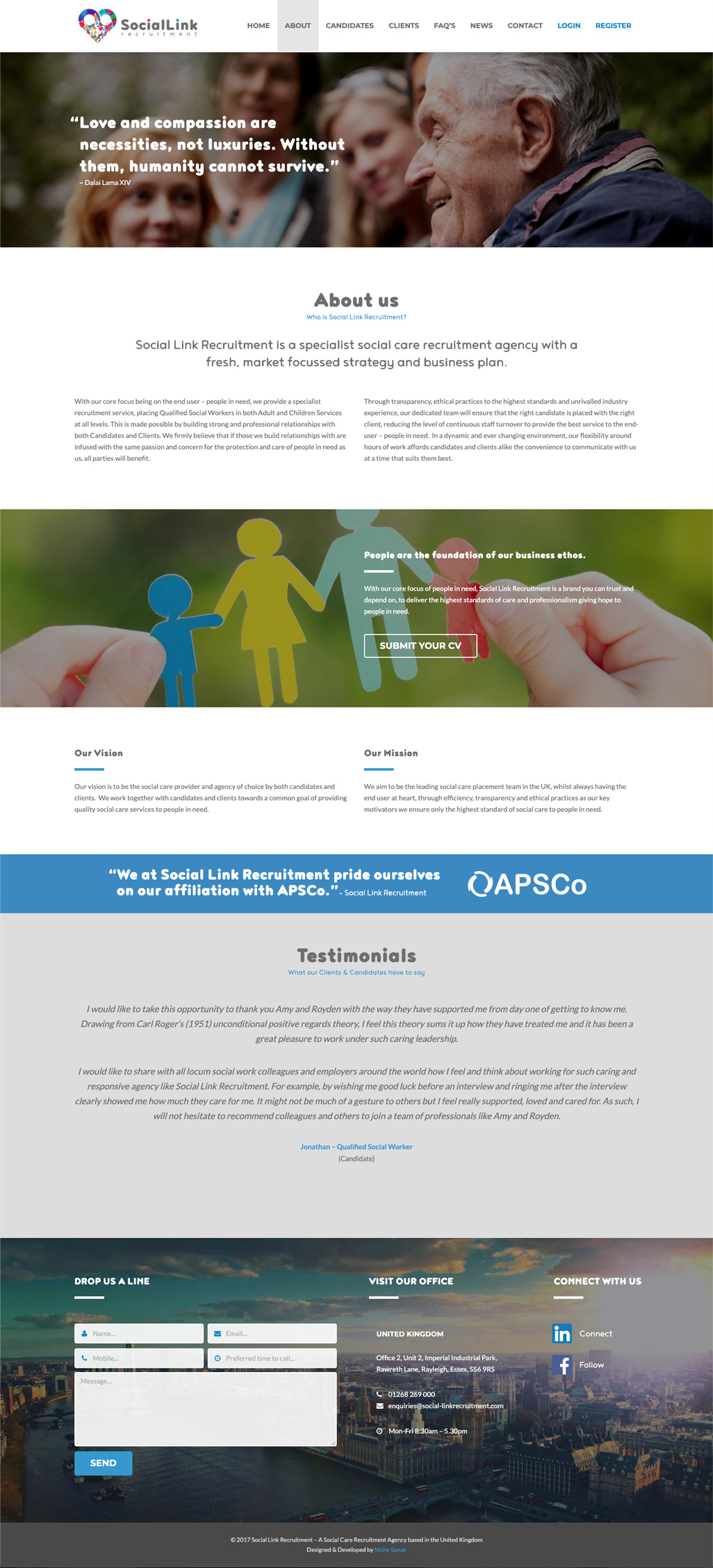
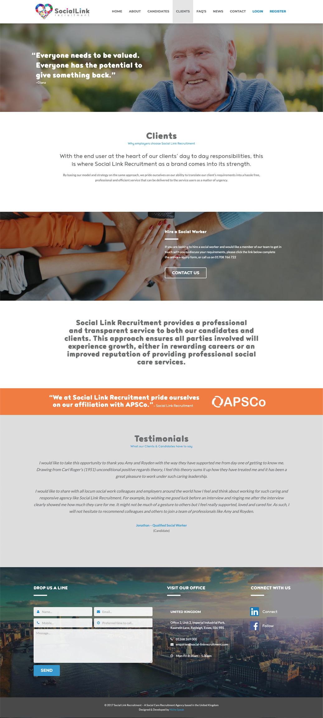
Social Link Recruitment places care assistants, support workers, and administrators into UK social care roles, across private and public sector employers. Graaft made the identity, website and the job portal. The work is one carer, one shift, one home. That ran every decision.
Approach
How we
tackled it.
The work is one-to-one. The brand had to show many lives at once, each one visible. The mark never settles into a single colour: the people aren't one person. The wordmark stepped back. The agency isn't the point.

Colour
Slate
#6D6E72Magenta
#E23591Cyan
#3098CDCloud
#F7F4F0Type
 VAG Rounded Black
 VAG Rounded Thin
Care assistants. Support workers. Administrators. Every placement, one person, one home.
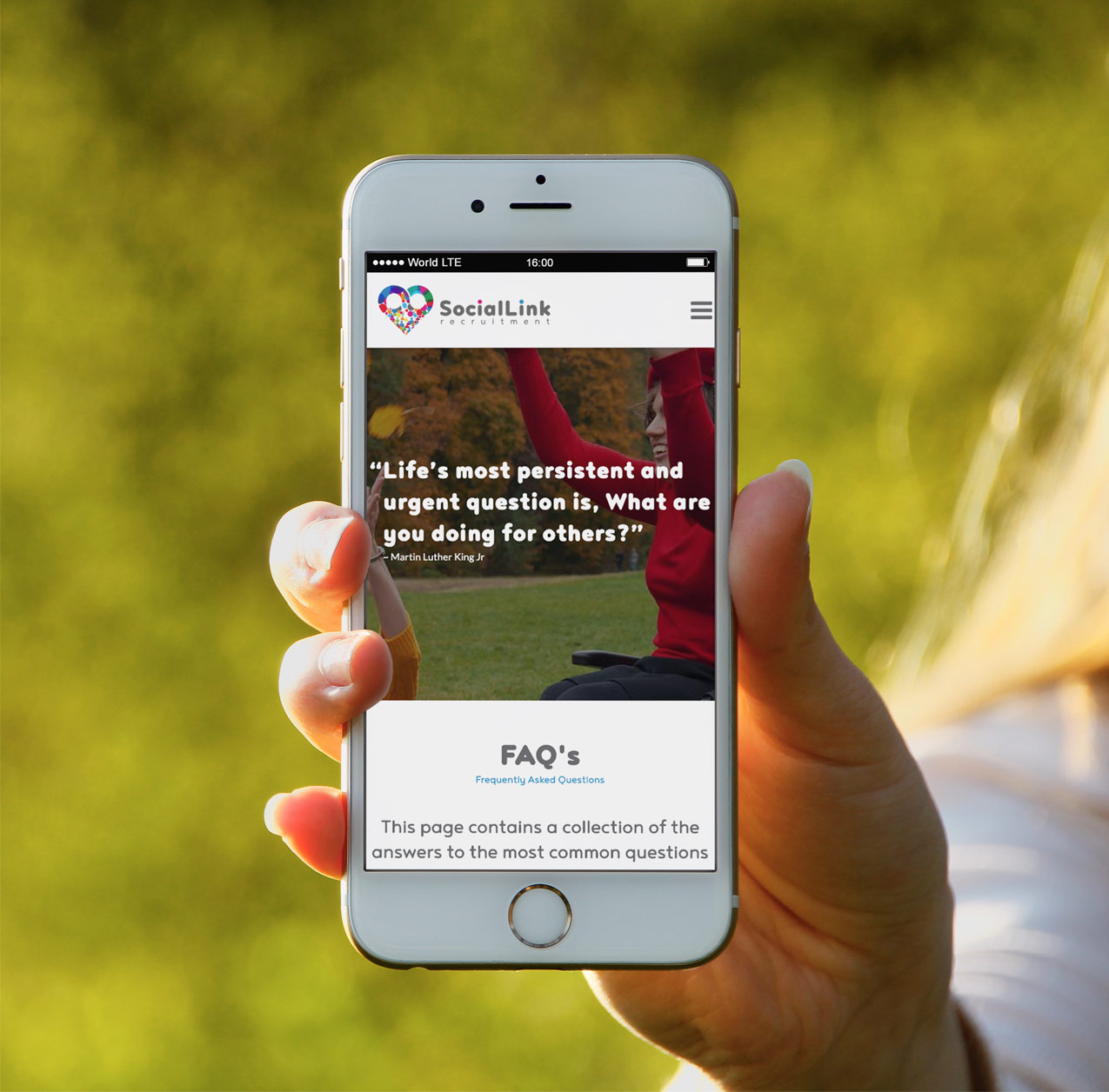

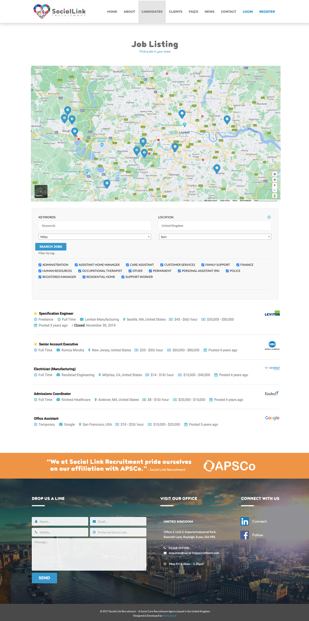
Portal
Every placement.
On the map.
A UK map, pins clustered by region. The act-of-placement moved into the portal. Every dot a person, geographic.
Outcome
The
result.
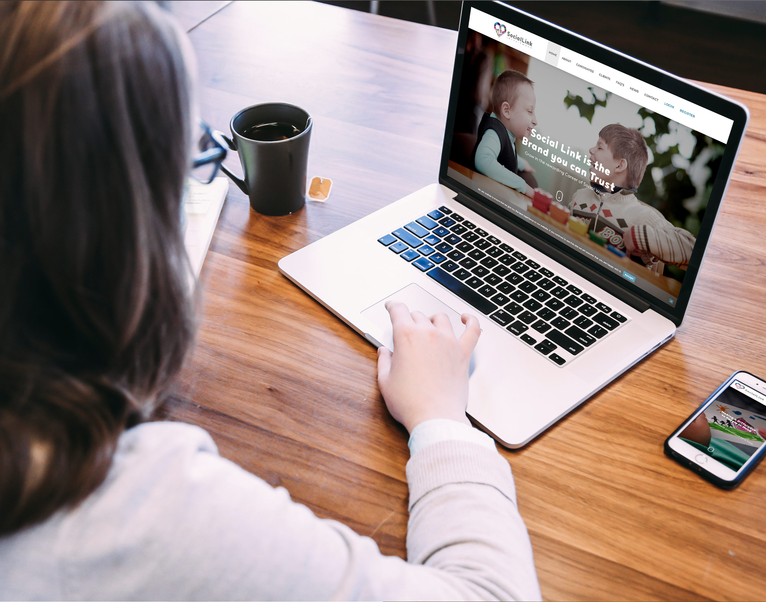
The mark travelled across job boards, email signatures, the portal, the careers pages. Recruiters read the heart first. Candidates read themselves in it. The wordmark followed. One story, lived end to end.