South China Clothing
Identity and website for a bespoke corporate clothing supplier. One spec. Four cities. One standard.
Brief
The brief.
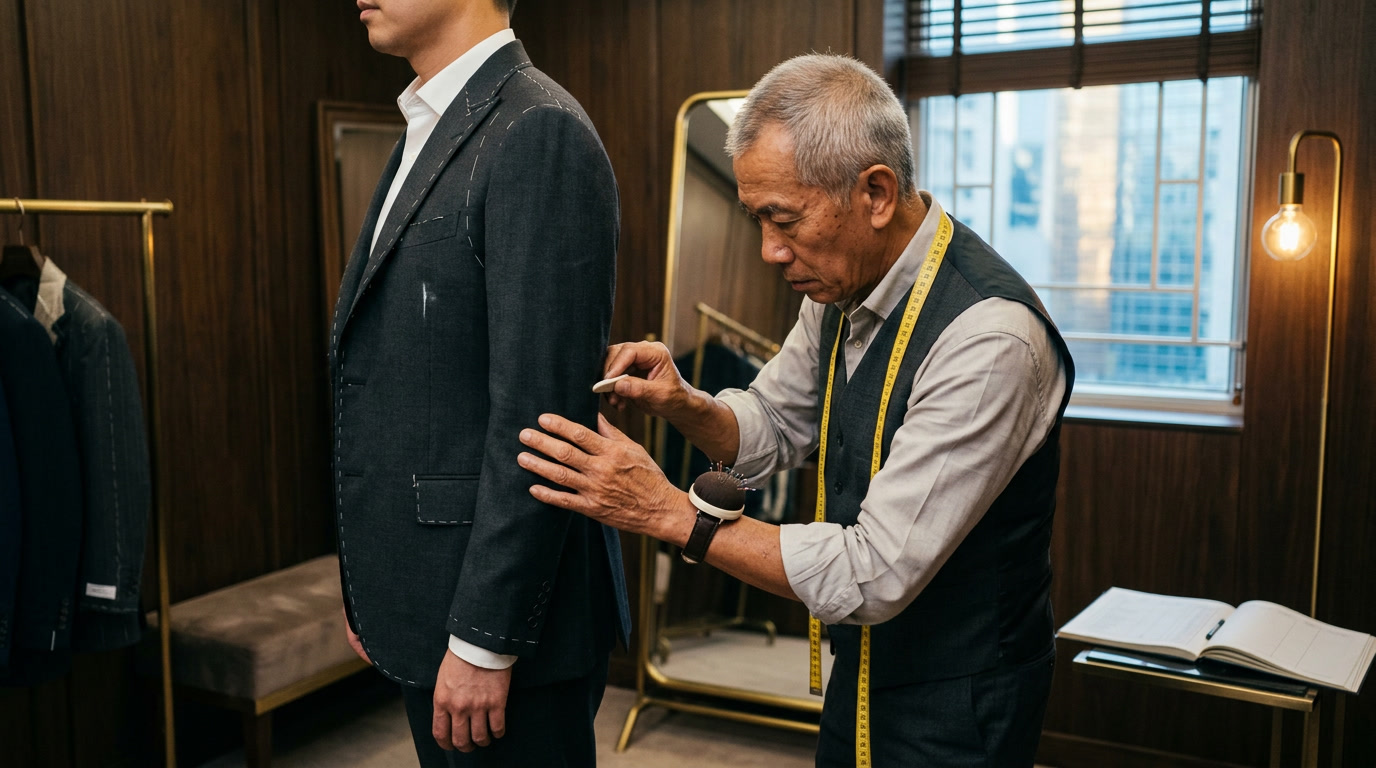
South China Clothing dresses executive teams, sales floors, and brand-facing staff for companies operating across Hong Kong, Johannesburg, Sydney, and Los Angeles. One specification. Four hubs. Natural fibres. Considered stitchwork. Graaft made the identity and the website. The standard was already theirs.
Approach
How we
tackled it.
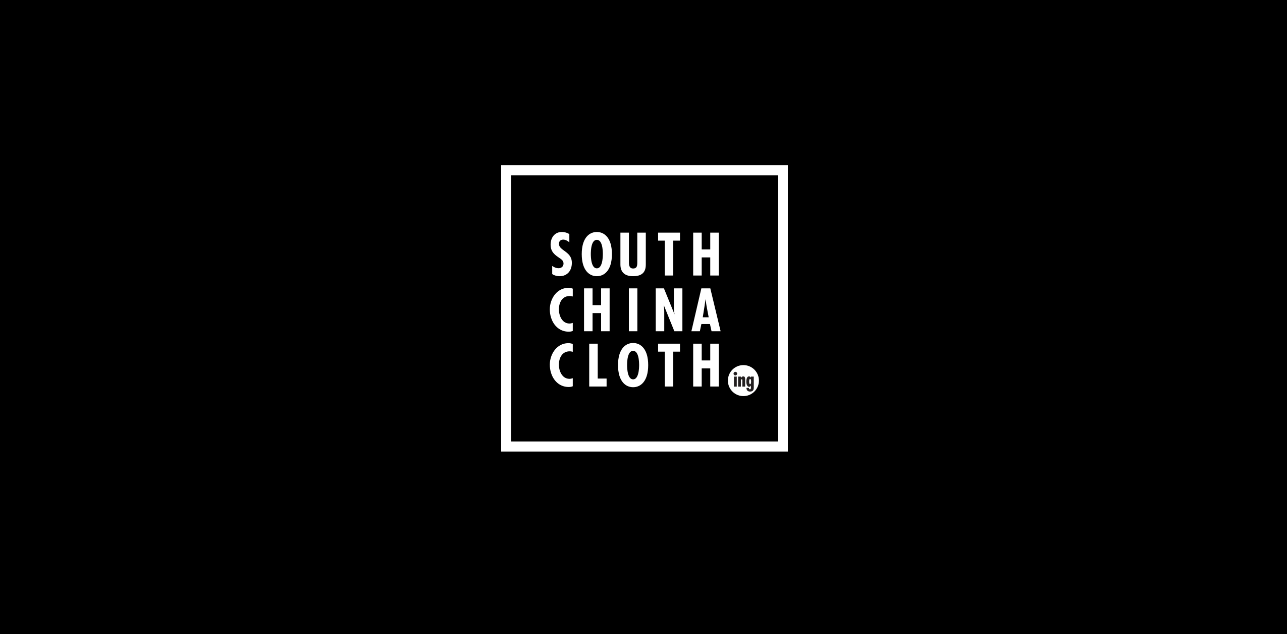
The boxed mark, a simplified take on Hong Kong shopfront signage stripped of saturation and noise, frames condensed type the way a spec sheet frames a part number. Four-letter city codes label the hubs: HKG, JNB, SYD, LAX. Monochrome paces the page. The yellow is the one fluorescent trace kept from the source.
Colour
Black
#0A0A0AYellow
#FFD500Smoke
#6B6B6BWhite
#FFFFFFType
 Helvetica Neue Condensed Bold
 Helvetica Regular
Bespoke corporate clothing for executive teams, sales floors, and brand-facing staff. Hong Kong. Johannesburg. Sydney. Los Angeles.
Specification
One spec.
Four cities.
In motion.
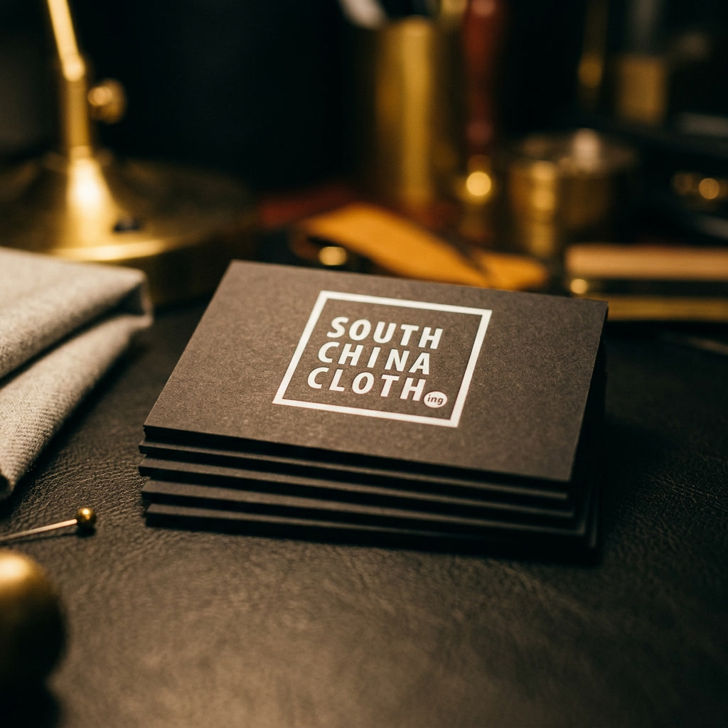
The mark stamps the document. City codes label the hubs. The yellow is drawn from Hong Kong street lighting. The system stays consistent on page and on screen.
Website
The same
spec,
online.
The mark, the product codes, and the single yellow stay consistent across every responsive breakpoint. Set in the same grid. Specified once. Standard everywhere.
Outcome
The
result.
A wordmark, a stamp, a colour discipline, and a four-city footprint in one system. A Hong Kong illustrator drew the building and the tag. Stationery, the website, and the brand register all run from the same spec sheet.