Seaya Holidays
The mark is a destination. The site books it.
Brief
The brief.
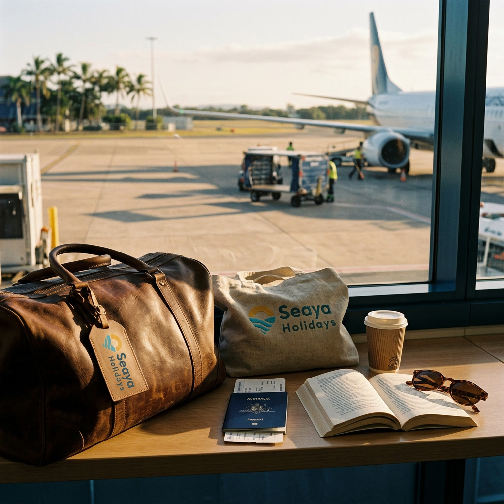
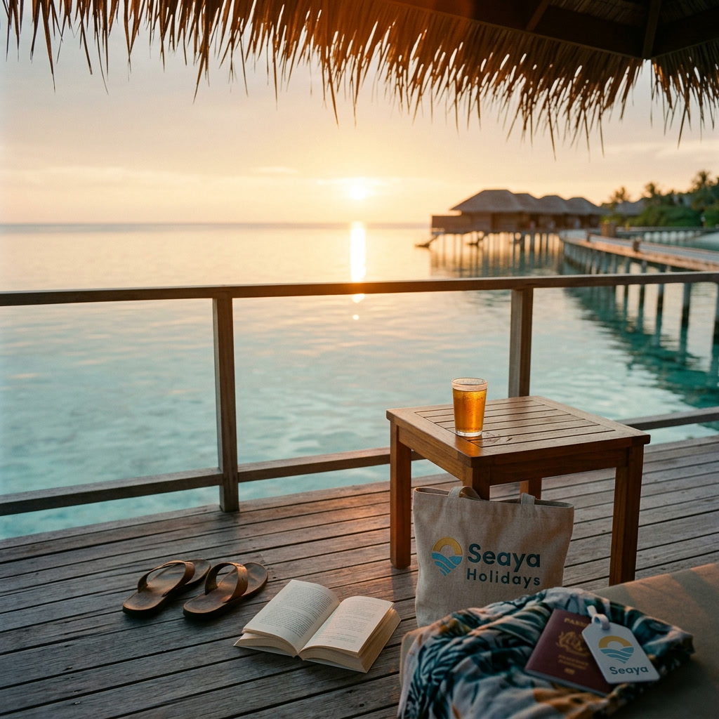
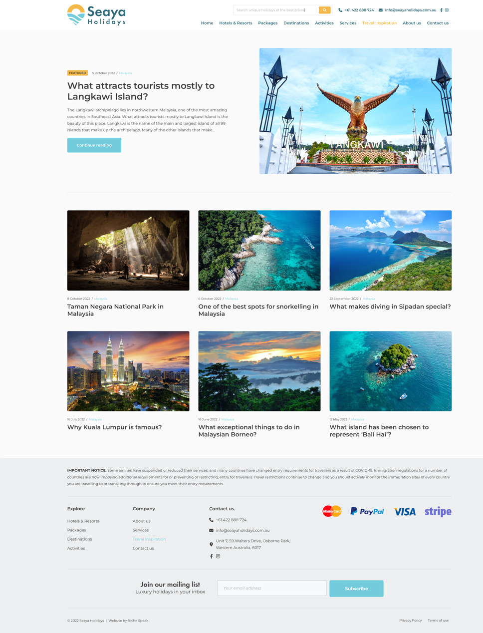
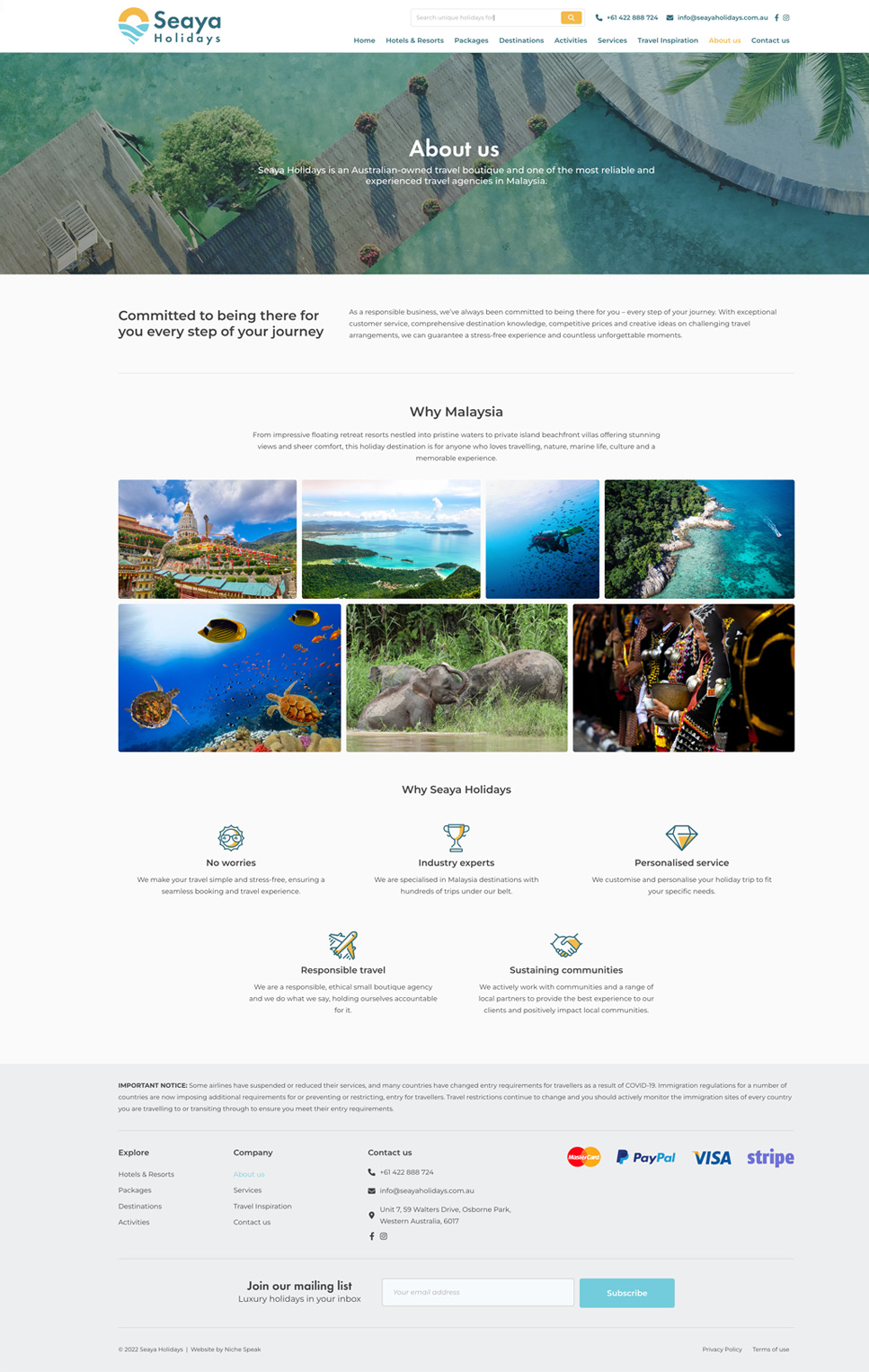
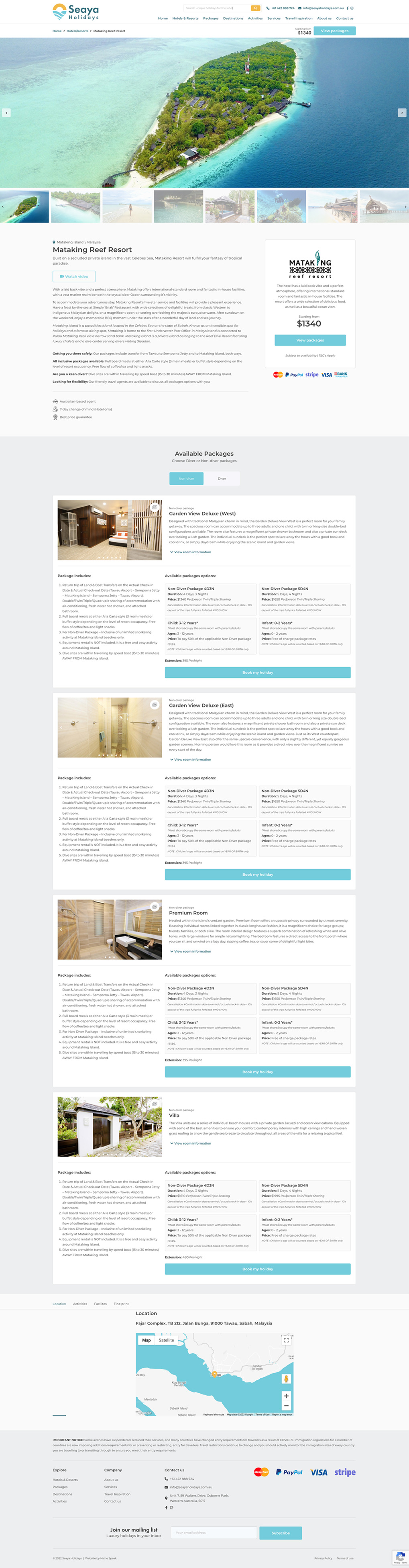
Seaya Holidays is an Australian travel agency with a curated portfolio of tropical escapes across Malaysia and Southeast Asia. Overwater bungalows. Dive resorts. Island experiences. They had the product. Graaft built the brand and the booking platform.

Approach
How we
tackled it.
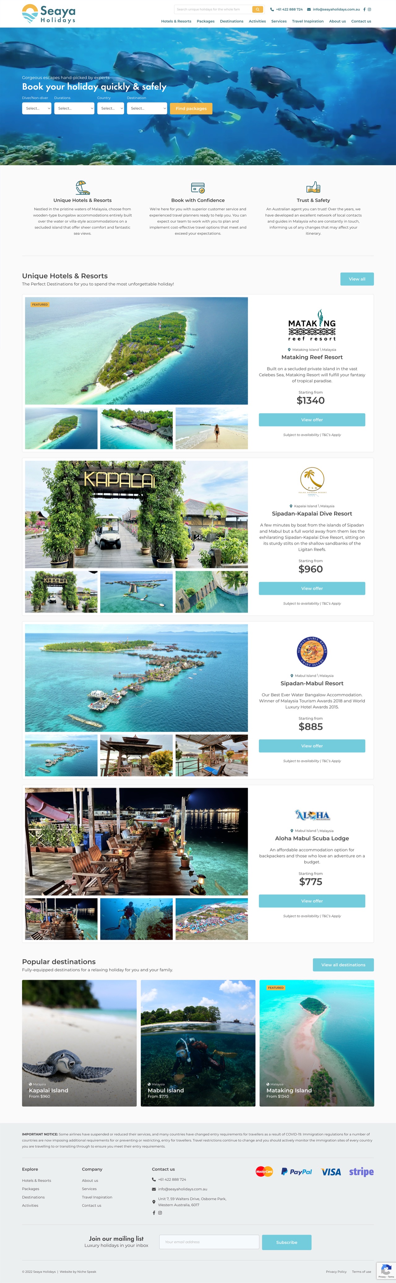
We started with the mark. The icon doesn't describe a destination. It is one: a location pin with the sun setting into it, ocean already there. The palette came from the same image. The booking site followed: two clicks from landing to package.
Colour
Deep Teal
#346E7COcean
#75CCDDAmber
#F5B949Sand
#FAFAFAType
 Futura Demi
 Futura Light
Overwater bungalows, dive resorts, and island escapes. Curated journeys across Southeast Asia.
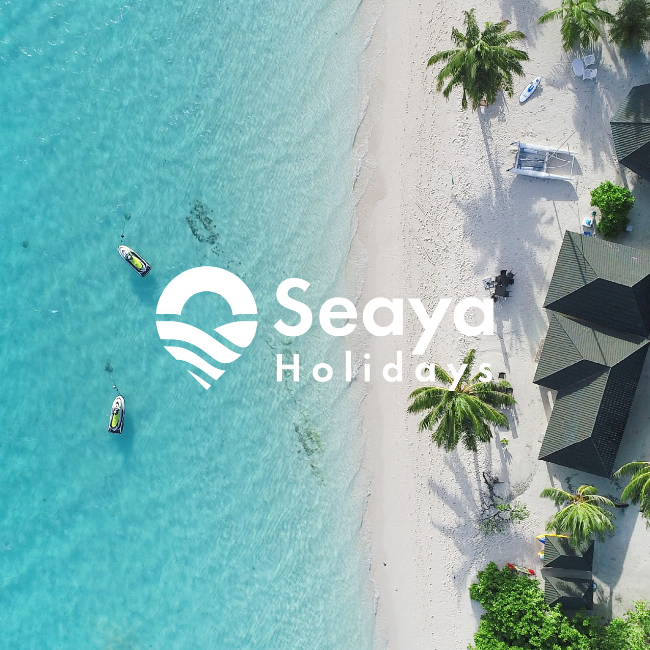
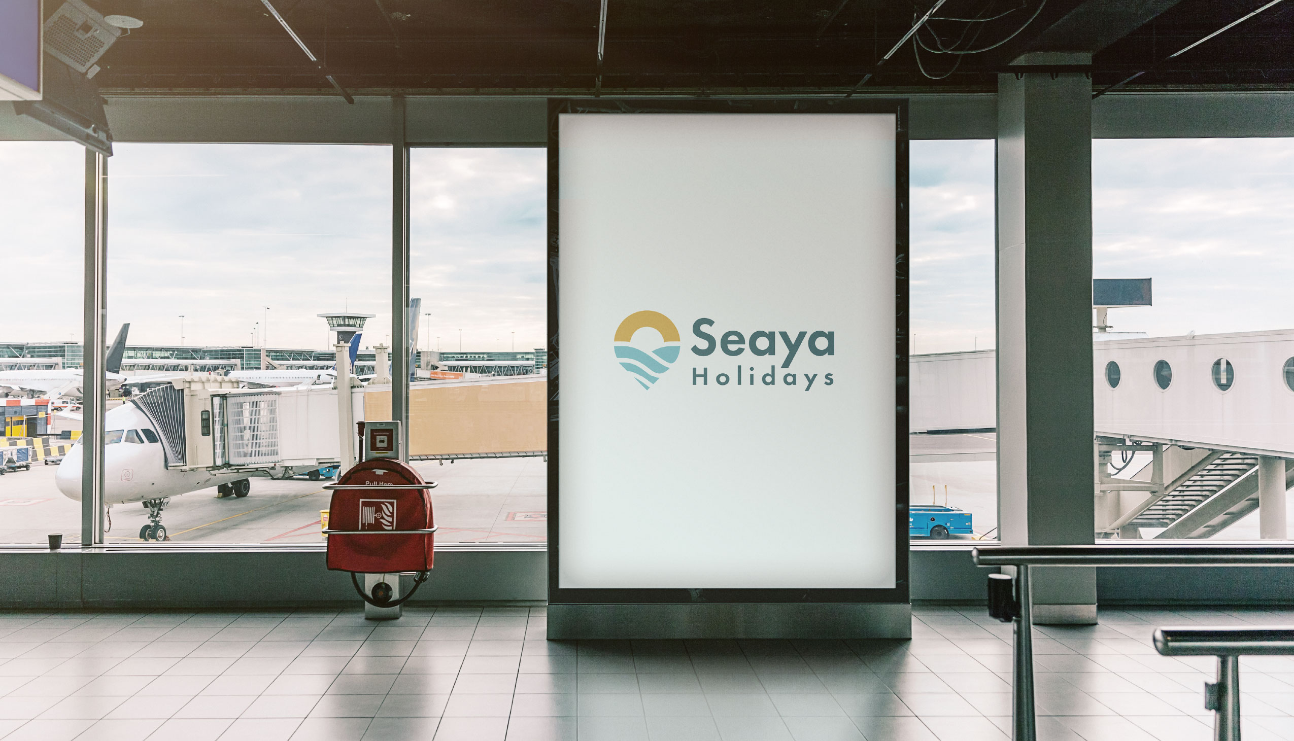
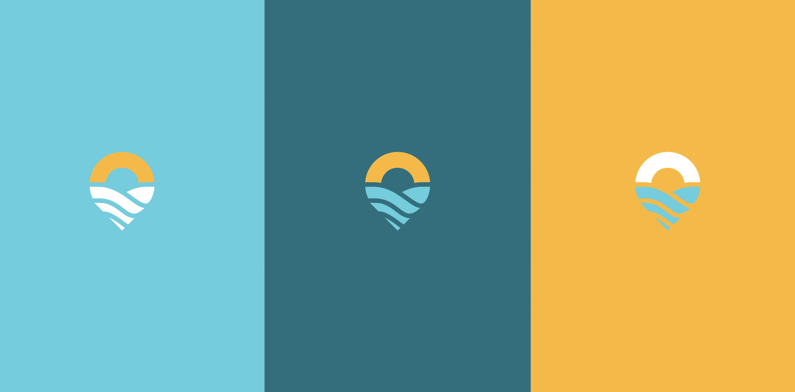
The mark
The sun
sets there.
A location pin with the sun already in it. The destination built into the icon. The palette came from the same place.
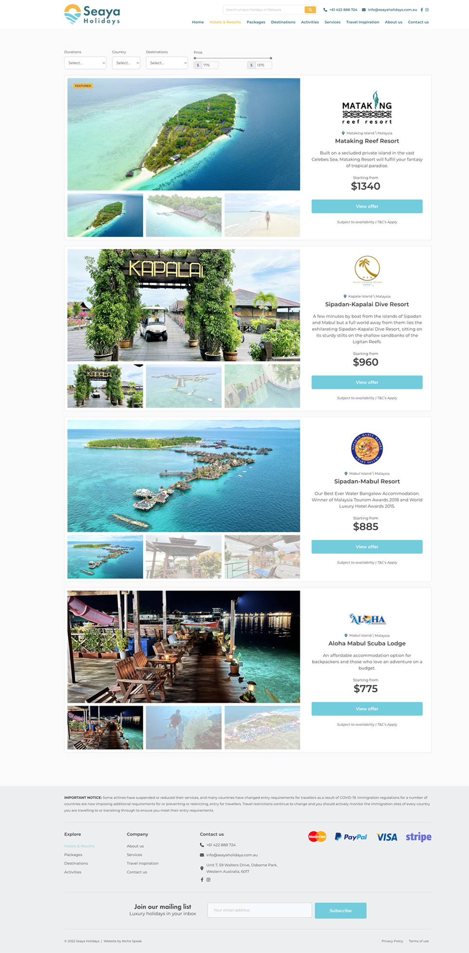
Website
Books,
not browses.
Destinations, packages, and hotel listings within two clicks of landing. Built for intent: a visitor who arrived already wanting to go.
Outcome
The
result.
A travel brand with a mark made for an airport billboard. The site launched with the full hotel and package inventory live. The brand surface matches the overwater bungalows on offer.