32 pixels, on a receipt. Where every identity starts.
Every visual identity has to read at 32 pixels: on a notification, a favicon, a printed receipt. Most marks don't. That is what the test is for.
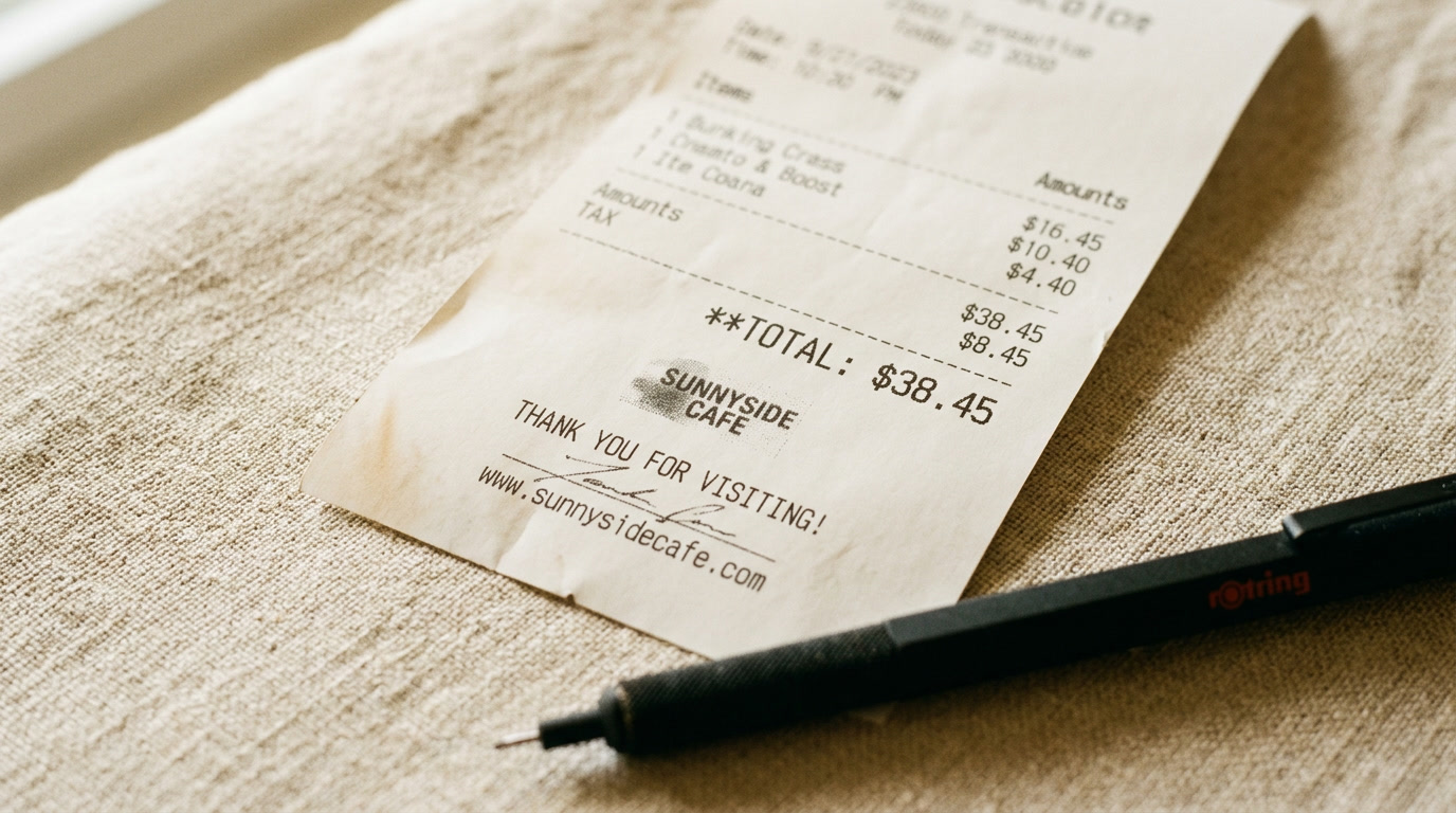
Every identity I work on gets printed on thermal receipt paper before it ships. It is not nostalgia. It is a test.
Not full size, not in colour. The mark at the size it appears next to a receipt total: about thirty-two pixels across, depending on the printer. That test tells me more about whether an identity is working than any slide at three thousand pixels on a cinema display.
The test is not about receipts. It is about whether a mark holds its form in its worst execution context, and thermal printing is the worst one I know. It renders in black only, at low resolution, on a machine that has been running hot for six hours. A mark that reads at that size in that condition is finished. A mark that needs the careful staging of a portfolio case study to be legible is still in progress, whatever the deck says.
Those are different things.
What fails at 32 pixels
Most marks fail, and the reasons are consistent.
The mark relies on gradient, which thermal printing cannot render at all. The mark carries several elements at different weights, which compress into noise below a certain size. The mark is a wordmark whose letterforms stop separating below about sixteen pixels per letter. The mark has fine detail that reads as intentional at display scale and as damage at thirty-two pixels.
The constraint underneath all four is one line: the mark has to be a recognisable form before it is readable text.
The contexts the receipt stands in for
The receipt is the anchor because it strips the most. But the same constraint runs through every small-scale context brand work meets in the field, and almost none of them appear in the case study.
A favicon in a browser tab is sixteen pixels. All that survives is shape, and the shape has to be findable in a bar of twenty tabs. An organisation whose favicon is a generic circle loses nothing by being confused with five others whose favicon is a generic circle.
An iOS app icon is sixty points on the Home Screen, roughly a hundred pixels at 2x. It has to work without the brand name, because most people do not read the label when they are scanning for an app they open every day. They read shape and colour.
A notification on a lock screen puts the mark at forty to fifty pixels, in a stack of notifications from every other app installed. If the mark does not hold there, the notification reads as coming from a category rather than from a brand. The category might be recalled. The brand will not be.
These share a structure with the receipt. They strip colour as a primary identifier, particularly in dark mode. They render the mark very small. And they appear while someone is scanning, not reading. A mark that passes at thirty-two pixels will generally pass all of them. A mark that fails is almost certainly failing at least half of them in production right now.
Why AI-generated marks fail it
The AI-logo category has a specific failure mode, and the receipt catches it every time.
Generated marks are optimised for impressiveness at the scale the model assumes they will be viewed at: a laptop screen, one to two thousand pixels wide, at reading distance. At that scale, gradient is impressive, fine detail is intricate, and multiple weights create hierarchy. The mark looks sophisticated.
At thirty-two pixels the same mark is noise. The gradient collapses into one grey. The fine detail smudges. The elements compress into a form with no distinctive shape. What impressed at presentation scale has no identity at receipt scale.
This is not an occasional outcome. In what I see, it is the majority outcome for generated marks that were never tested small during selection. The model is not evaluating at receipt scale. It produces what looks good at the scale it was prompted for. The selection discipline is what catches it, which is the same argument the hand-edit pass makes about imagery, and the six tells make about prose.
AI generation optimises for presentation scale. The receipt runs at receipt scale. Running it before you select is the only way to know you are selecting from the right candidates.
Run the test before you select, not after
Running the test before selection does more than catch failures early. It changes which candidates are worth developing at all.
When you know the test is coming, you generate against it. Not as the only constraint: the mark still has to hold at every other scale, carry the brand register, and be distinctive in its competitive set. But thirty-two pixels eliminates a whole category before it consumes development time. The intricate, detail-dependent mark. The geometric pattern that needs resolution to read. The letterform whose distinguishing feature disappears when small. The icon that uses gradient to carry meaning.
A process that starts at thirty-two pixels and works up never develops a mark that fails, because the test is the admission criterion. A process that starts at presentation scale and tests down regularly develops marks that fail, and then faces a choice between a weak foundation and a restart. Finding this out after six weeks of development is expensive. Finding it out before selection costs nothing.
Simplicity is not the answer
The obvious response to all this is to simplify, and it is the wrong one.
Geometric simplicity produces marks that are distinct at one scale and invisible at another. The circle that could belong to anyone. The triangle that means nothing. Simplicity solves legibility and abandons identity.
Geometric decisiveness is the answer. The mark that is instantly itself because of a specific decision in its geometry, not because there is very little geometry to look at. At thirty-two pixels letterforms are suggestions, so a wordmark depending on legibility at that size is working against physics. The marks that pass are the ones whose form has its own identity: a shape that is distinctive whether or not you can read it.
A mark that only works big is not finished. The receipt is where it finds out.
The Graaft marks
The Graaft wordmark and the product marks were tested at thirty-two pixels before they were developed.
The wordmark holds because the letterform decisions were made with small-scale legibility as a constraint. The G at thirty-two pixels is a G. What distinguishes the letterform is structural rather than decorative, so it survives. Had the distinction needed resolution to see, it would have been reconsidered.
The product marks hold at notification size because the shape decisions were made for notification size. Each one reads correctly when the letterforms no longer do, and colour works as a secondary identifier rather than a load-bearing one.
That is a claim about process, not about visual quality. The test ran before development. The marks that failed it were not developed.
Why thirty-two
Thirty-two pixels is the size of a notification badge. It is roughly a favicon in a browser tab. It is the mark on a thermal receipt at standard DPI.
These are the contexts where an identity is most often encountered by someone not paying attention to it. They are reading their email, scanning their history, taking a receipt from a transaction they have already stopped thinking about. The mark has to do its work in a moment of distraction, at a size that strips away everything added for impressiveness.
Most identity case studies are shot at presentation scale: the logotype at three thousand pixels on white, the mark on a mockup at reading distance, the stationery suite where every element is visible. Those are the conditions where the identity looks best. They are not the conditions where it works. The field is not the portfolio, and the receipt is a proxy for the field.
That is the test. Not harsh. Honest.
Every identity I design starts at 32 pixels, on a receipt. I work up from there.
The test ran this morning on the identity I am working on today. The receipt is telling me something. If I listen to it before the presentation, I do not have to hear about it after the launch.